
Topic 18: Visualizing Data#
Visualizing data is something we commonly do as scientists, and it makes perfect sense for us to leverage Python where we can to automate the process of generating graphs and figures. In this section, we will explore how to use the popular plotting library Matplotlib to achieve this goal.
Note: you can choose to use Jupyter Notebooks for all of these tasks if you prefer! It is a common usecase to use such notebooks for data visualization.
Part 1: Matplotlib Basics#
Before we begin, we need to make sure we have Matplotlib installed, so ensure you successfully run pip install matplotlib in your terminal.
Task 1#
Create a new file in the topic folder called
matplotlib_intro.pyPaste in the following code:
import os
import numpy as np
import matplotlib.pyplot as plt

# Get the directory of this script
script_path = os.path.abspath(__file__)
script_dir = os.path.dirname(script_path)

# Construct the full path to test_data.txt
data_path = os.path.join(script_dir, "test_data.txt")

# Load data with numpy
data = np.loadtxt(data_path)

# Assume the first column is x, second column is y
x = data[:, 0]
y = data[:, 1]

# Create a basic plot
plt.plot(x, y, label="Sample Data")
plt.xlabel("X-axis")
plt.ylabel("Y-axis")
plt.title("Basic Plot from test_data.txt")
plt.legend()
plt.show()
Run the script, and a window should appear displaying a plot of the data.
Analysis#
Import Matplotlib: For plotting, we want to use the
matplotlib.pyplotpackage. As we did with NumPy, we use an alias (plt) to make our life easier:import matplotlib.pyplot as plt
Import data: NumPy is used to read in the same dataset we have used in a previous topic, much in the same way as seen before.
The code assumes two columns in
test_data.txt, which we assign to two variables:xis the first column (index 0).yis the second column (index 1).
Creating a plot: To create a “plot” object we use the
plt.plot()function, which takes in data and some parameters, and then allows us to draw the plot.Using
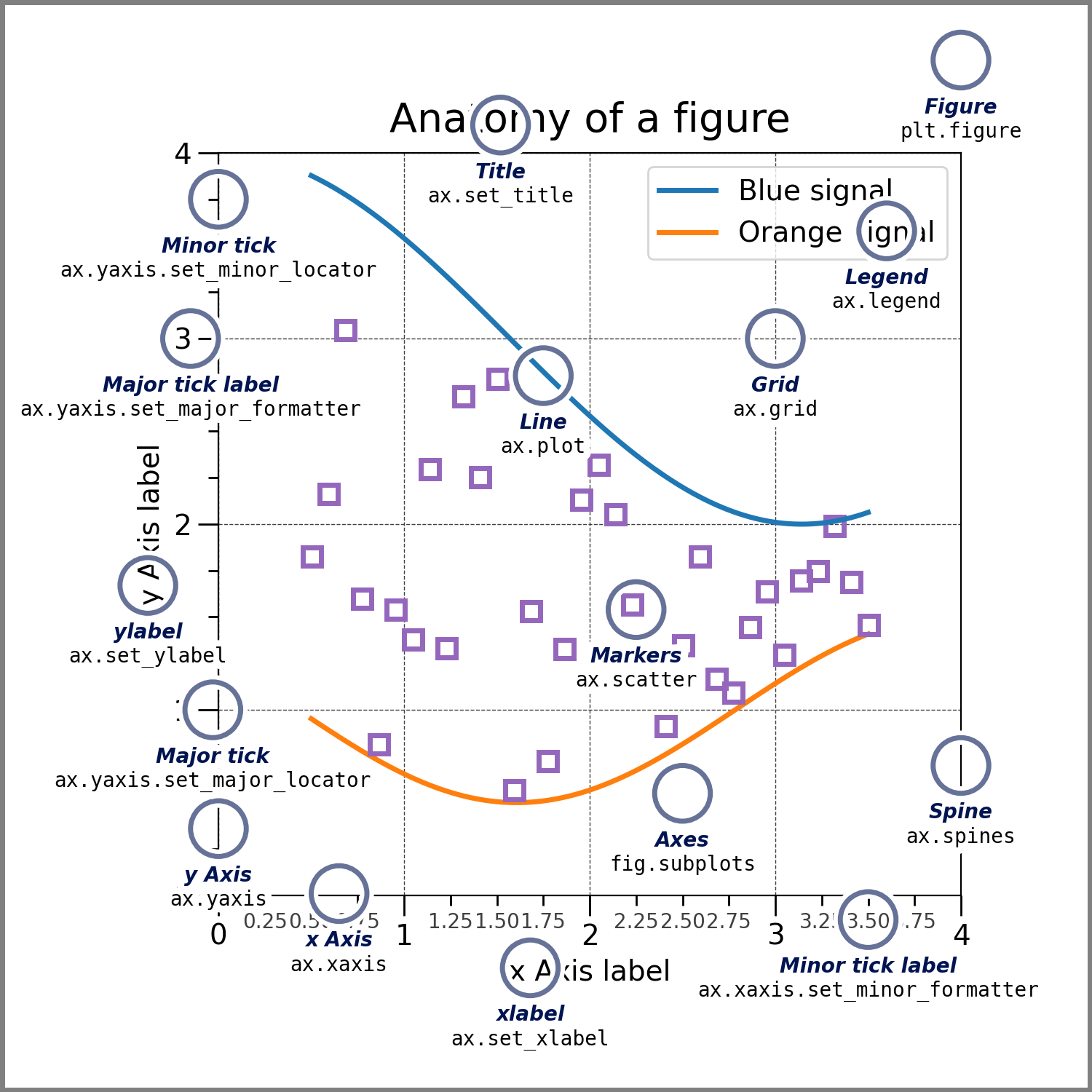
plt.xlabel()andplt.ylabel()we can set the appropriate x- and y- axis labels, and usingplt.title()we set a title.Check out the image below (taken from the official documentation) to see the “anatomy” of a Matplotlib figure.
You should have a look through the documentation for
plt.plot()to see what else you can do with it.
Displaying the plot: Finally, using
plt.show()will display the figure by opening a window on your computer.Note: we have not saved this as an image anywhere!
Task 2#
Modify your
matplotlib_twodata.pyfile by pasting the following block of code to replace the block of code at the end.import os import matplotlib.pyplot as plt import numpy as np # Get the directory of this script script_path = os.path.abspath(__file__) script_dir = os.path.dirname(script_path) # Construct the full path to test_data.txt data_path = os.path.join(script_dir, "test_data.txt") # Load data with numpy data = np.loadtxt(data_path) # Assume the first column is x, second column is y x = data[:, 0] y = data[:, 1] # Create a new set of data by arbitrarily scaling the original y-axis data y2 = y * 1.5 plt.plot(x, y, label="Sample Data") plt.plot(x, y2, label="Scaled Data", linestyle="--") plt.xlabel("X-axis") plt.ylabel("Y-axis") plt.title("Comparing Two Data Series") plt.legend() plt.show()
Run the script and see if you spot anything different.
Take a closer look at the code and identify what has changed (and why?).
Analysis#
Let’s focus on the two new lines of code here to see what we have changed this time around. The labels and titles have also been changed, but the fundamental code is the same.
y2 = y * 1.5
Very simply, we are taking the NumPy array
yand multiplying each element by 1.5 and saving it to a new arrayy2.Remember vectorization? It allows us to do this very easily!
plt.plot(x, y2, label="Scaled Data", linestyle="--")
Here we are calling the
plt.plot()function a second time, this time with the same x-axis but with our newy2array as the y-axis dataWe are also using the
linestylekeyword argument to apply a different style ("--"will give us dashed lines) to our second set of data in this plot.Take a look at the relevant documentation page for other available linestyles. Feel free to have a play with different styles for either (or both) of the data sets.
Programming Challenge
Write a script that will read the spec_data.csv file found in the topic folder and create a plot with appropriate labels and no legend.
You will need to take into account that the file has a “header” row which gives each column a label, and that the data is in a comma-separated values format.
The np.loadtxt() documentation might be useful to you in addressing these.
Raw data from: https://data.hpc.imperial.ac.uk/resolve/?doi=8763
Part 2: Curve Fitting#
Task 3#
Create a file called
matplotlib_curvefit.pyand paste in the following:import matplotlib.pyplot as plt import numpy as np from scipy.optimize import curve_fit # Generate a made-up dataset that follows y = 2*x + 5 x = np.linspace(0, 10, 50) a, b = 2.0, 5.0 # Generate noise (random numbers) with mean 0 and standard deviation 0.5 noise = np.random.normal(0, 0.5, size=len(x)) y = a * x + b + noise def func(x, a, b): return a * x + b # Fit the linear model optimal_parameters, covariance = curve_fit(func, x, y) a_fit, b_fit = optimal_parameters y_fit = func(x, a_fit, b_fit) plt.plot(x, y, marker="o", linestyle="", label="Synthetic Data") plt.plot(x, y_fit, linestyle="--", color="r", label=f"Fitted: a={a_fit:.2f}, b={b_fit:.2f}") plt.xlabel("X-axis") plt.ylabel("Y-axis") plt.title("Curve Fitting Linear Data") plt.legend() plt.show()
Run the script a couple of times and make a note of the values of the fitted parameters (in the legend).
Analysis#
There are 2 main things happening in this script; generating a random linear data set, and fitting a linear regression and plotting it.
Let’s took a look at each section, line-by-line where needed.
Generating random linear data#
x = np.linspace(0, 10, 50)
We use the
np.linspace()function of NumPy to generate an evenly-spaced linear array of 50 numbers from 0 to 10.This corresponds to our x-coordinate data, and so we call this array
x.
a, b = 2.0, 5.0
As we will be using the \(y=ax+b\) format of a straight line, we need to set some arbitrary values for our gradient (
a) and y-intercept (b).Note: we are assigning both variables on a single line by using commas on either side of the
=!
noise = np.random.normal(0, 0.5, size=len(x))
Since we don’t want a perfect straight line, we will generate some noise by creating an array equal in size to our
xarray filled with random numbers with a mean of 0 and a standard deviation of 0.5.To achieve a mean of 0, some values will be positive, and some will be negative.
Feel free to use
print()to see the contents of this array, or even plot them withplt.plot()!
y = a * x + b + noise
Finally, we combine everything to determine our
yvalues.Rather than being exactly a straight line, our y-coordinates will be ever-so-slightly shifted by the noise we have added.
Fitting a linear regression#
With our random “data”, we use SciPy to fit a function of our choosing to the model. We could use NumPy’s polynomial fitting, but it is much more powerful to be able to get parameters from our own functions as data will not always follow a simple trend.
def func(x, a, b):
    return a * x + b
Here we are defining a function which we will feed into SciPy’s
curve_fit()function.We are expecting a linear relationship, so our function will be in the form \(f(x)=ax+b\), where we are hoping to find the values of \(a\) and \(b\).
In a more realistic scenario, we would not know the values of these already.
If we were fitting an exponential or logarithmic function, we would modify
func()accordingly.For example, for an exponential fit we may use the following:
def func(x, a, b, c):
    return a * np.exp(b*x) + c
optimal_parameters, covariance = curve_fit(func, x, y)
We now use SciPy’s
curve_fit()function, which takes in a model function (here,func()) as well as our input data and outputs a couple of things for us.First, it ouputs some
optimal_parametersthat contains the optimal parameters for our model function to fit the selected data through a least squares analysis.The second output gives the approximate
covarianceof our optimal parameters, which we can use for a more detailed error analysis (not in this task).
a_fit, b_fit = optimal_parameters
In this step we are simply splitting up the
optimal_parametersarray into individual parameter variables.
y_fit = func(x, a_fit, b_fit)
Here we are generating a series of points for our straight line based on the fitted parameters
a_fitandb_fit.This is made very easy by just using the function for the equation of a straight line we have already provided.
Note: we are continuing to make sure of NumPy’s vectorization here by applying the function to each element in the array
xin a single line!
plt.plot(x, y_fit, linestyle="--", color="r", label=f"Fitted: a={a_fit:.2f}, b={b_fit:.2f}")
We want to add the fitted line to our plot, so we just use
plt.plot()again with the fitted y-values.By using appropriate keyword arguments, we can format this to our liking. More details on how to do this are in the Matplotlib documentation, which you are encouraged to look through.
Our final figure should look a bit like this, but with different values, of course
Programming Challenge
See if you can calculate the standard deviation error in the parameters \(a\) and \(b\), and display these in the figure legend.
Task 4#
We have made figures, but how can we actually save them to use them in a report? By saving it as a file, of course.
Create a new file called
matplotlib_savefig.py.In your new file, paste the following code:
import os

import matplotlib.pyplot as plt
import numpy as np

# Generate a simple dataset
x = np.linspace(0, 10, 50)
y = np.sin(x)

# Create the plot
plt.plot(x, y)

# Define the output file path (saving in the same directory as the script)
script_dir = os.path.dirname(os.path.abspath(__file__))
output_path = os.path.join(script_dir, "sine_wave_plot.png")

# Save the figure
plt.savefig(output_path)
Run the script.
Check your topic folder to locate the saved file and open it.
Analysis#
Creating data and a plot: We create a simple data set of 50 data points along \(f(x)=\sin x\) using
np.linspace()for our x-values andnp.sin()for our y-values.Determine an output filename: Just as we had to give the full filepaths before when reading data, it is best practice to create full paths when writing data as well.
You can change the file format by specifying a different file extension (e.g.,
.jpg), but a vector-based format such as.pngis generally preferred for diagrams.
Save the figure: Using the
plt.savefig()function, we save our plot to the chosen output path.You will get no visual confirmation that this has happened, other than the file being created.
Running the script again will overwrite this file, so be mindful if you make changes to it using other software!
Summary#
By the end of this seotion, you will have:
Learned to create and and customize plots with Matplotlib, including multiple datasets and modifying labels and linestyles.
Demonstrated using SciPy’s curve_fit for a simple linear fit, including fitting parameters and displaying them in the plot.
Saved a figure to a file for later use.